Class Assignment: I redesigned my original logo I made for this winery as well as updated and bettered their website. I was very proud of this outcome because my professor had told me she was very impressed with my work and really enjoyed it.
Process
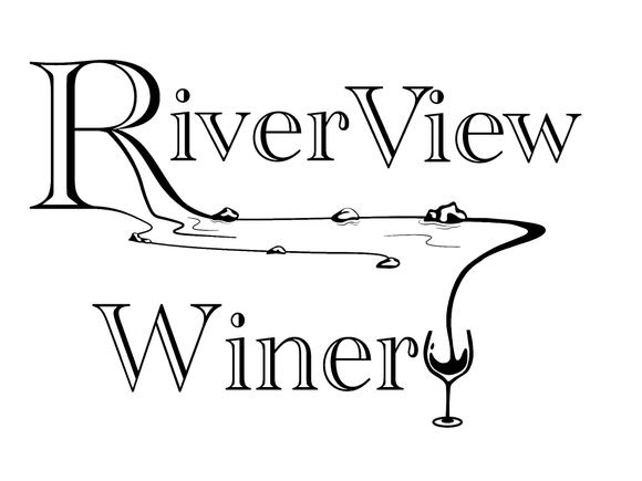
I wanted to rebrand my own logo because I believe I could have done a better job with the knowledge I have now. I ended up removing the river and wine element because of the name of the company–RiverView Winery. The name is right there, you know what this company is.
Initial Redesign
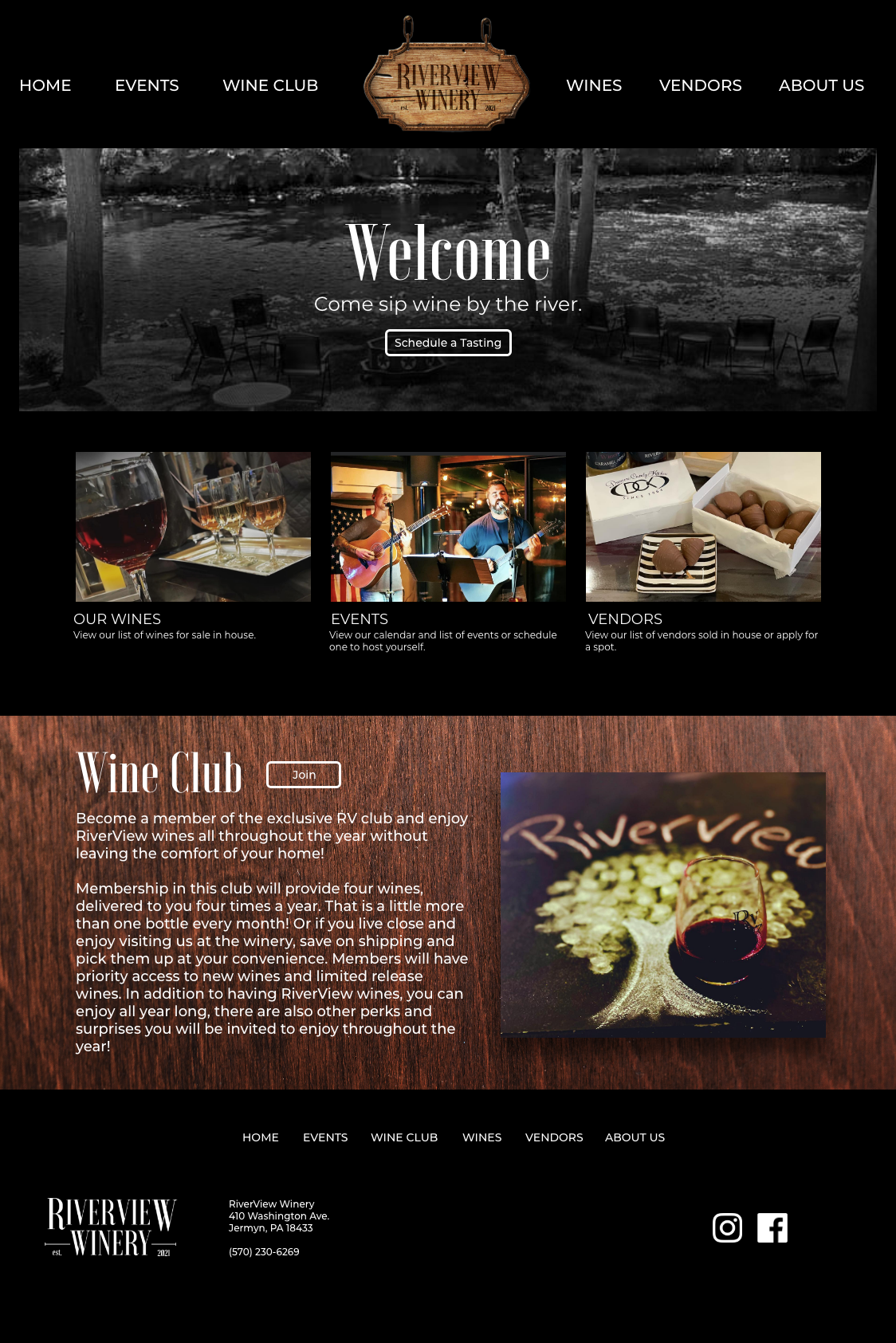
Below are my initial redesigns of the homepage. I wanted to keep the black background because I thought it felt chic. I tried to utilize a lot of their own photos because they only used stock photo images.
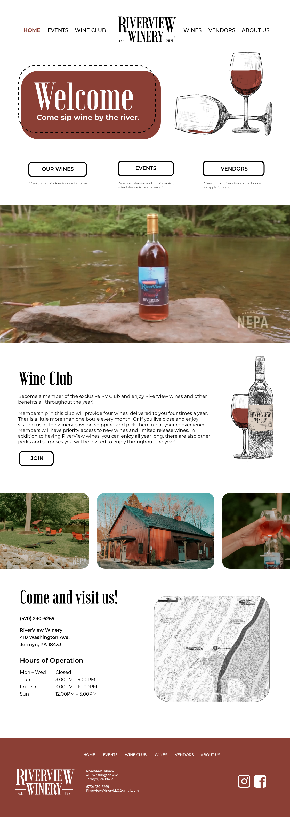
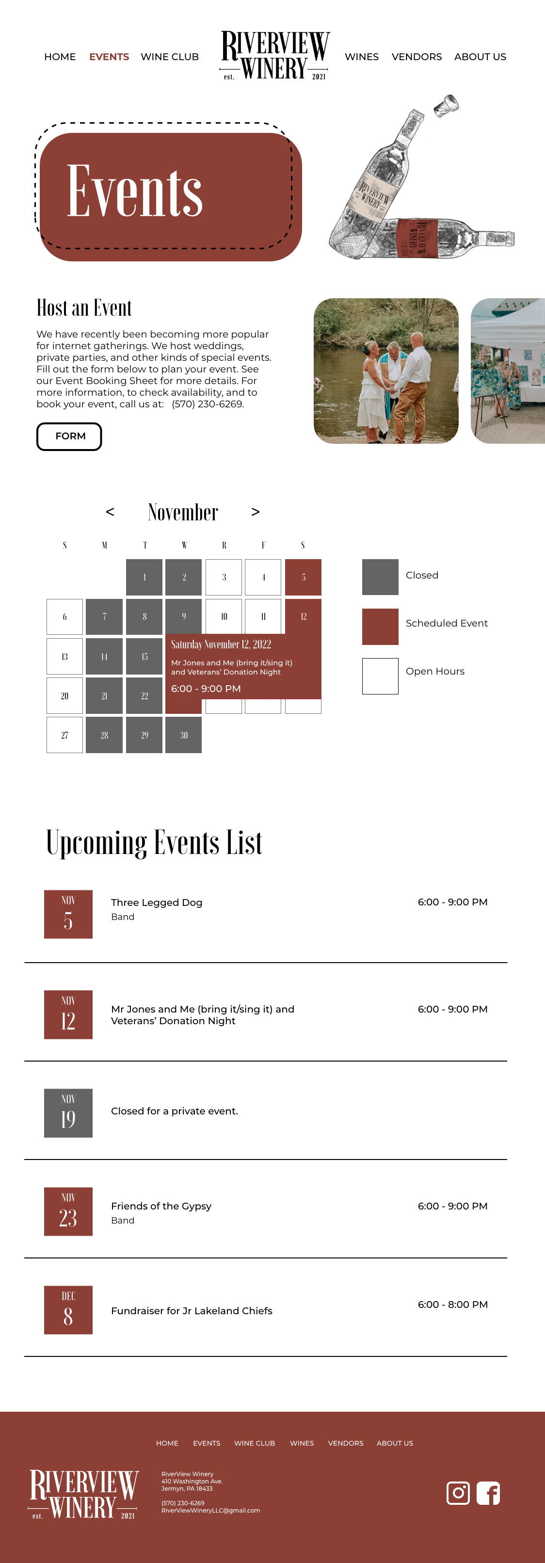
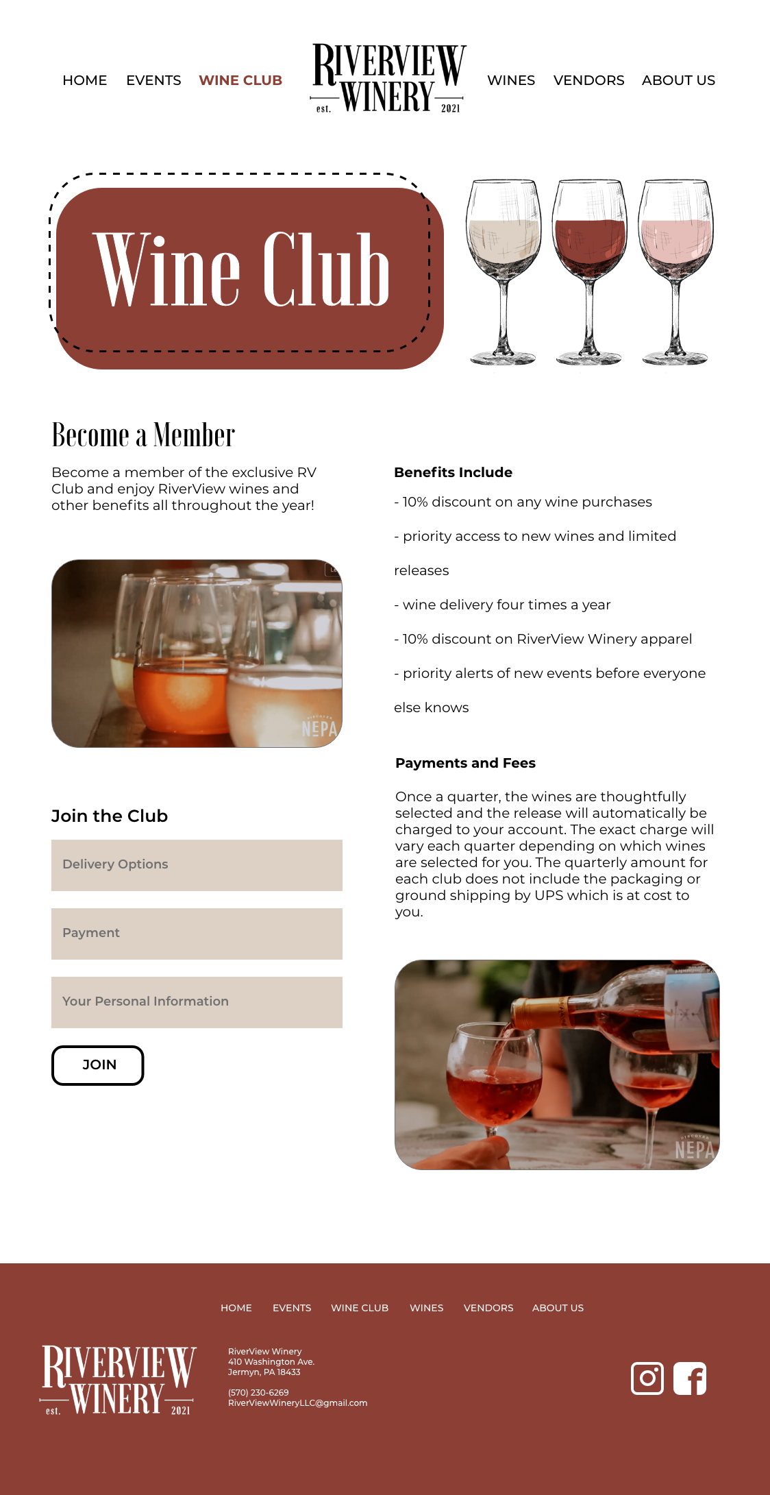
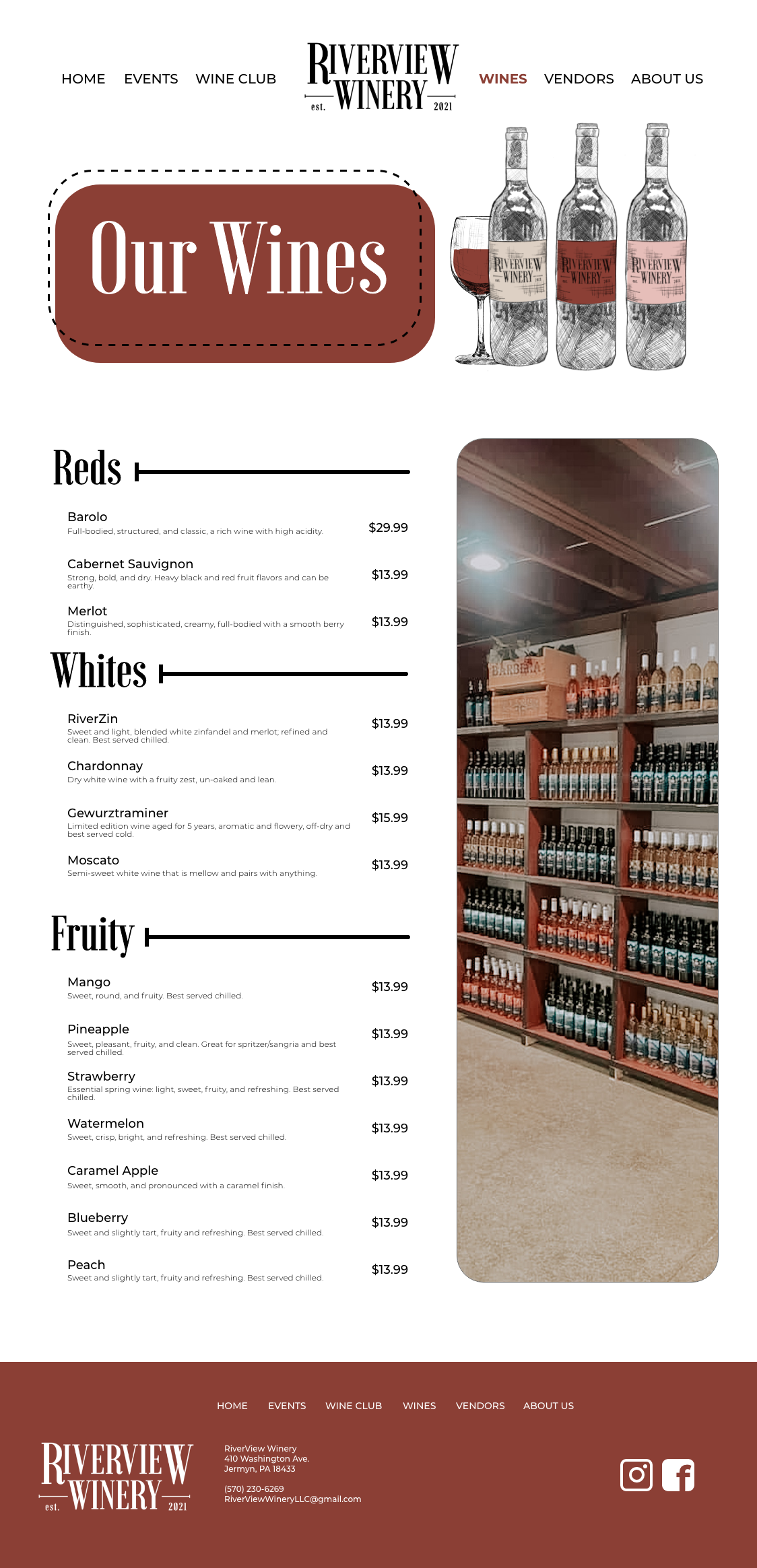
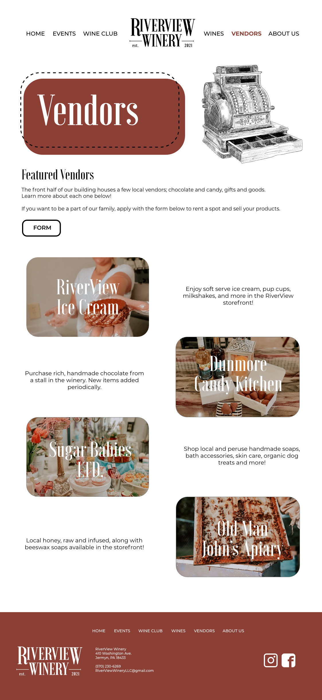
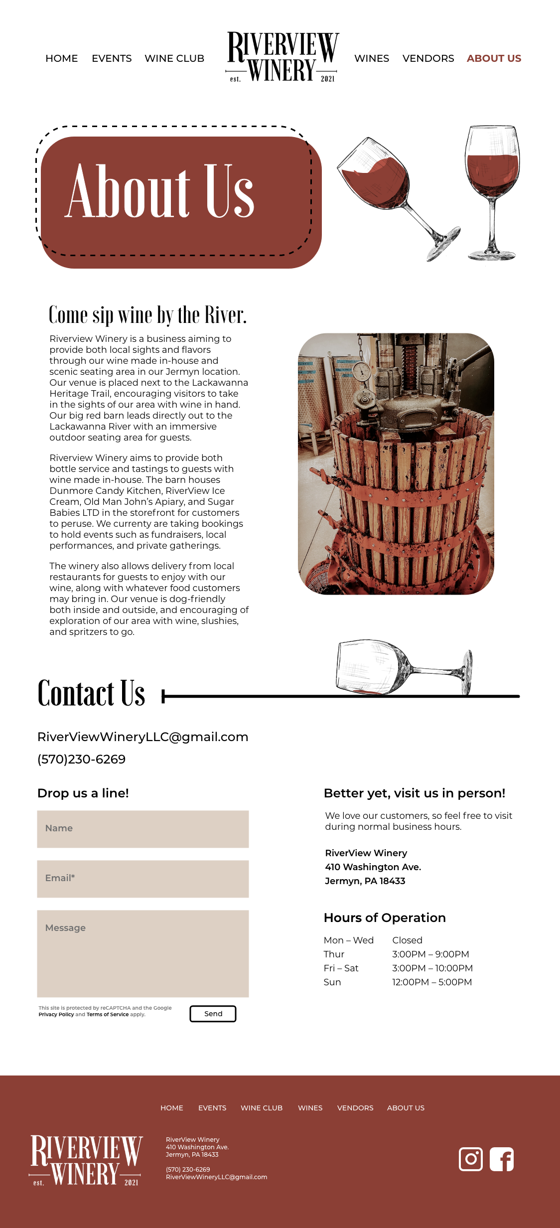
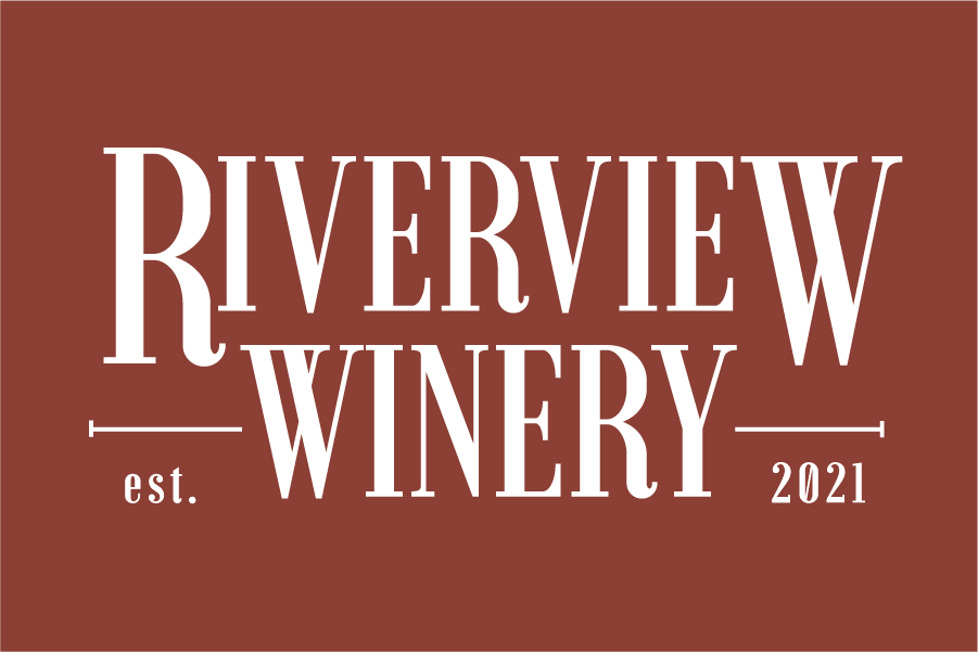
Final Design Style
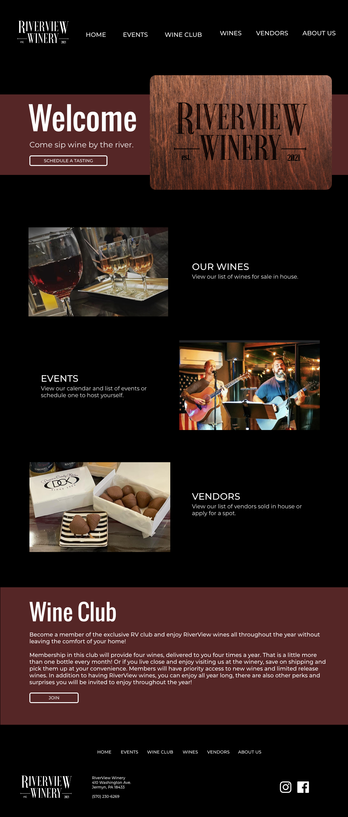
I ended up switching my idea completely by making it more light and fun but still keeping a professional chic look. I also incorporated a lot of hand-sketched images for a nice design element and to keep that rustic feel they initially wanted.
Here you can view the user flow.